Here is my video blog of me working my way through the Target & Akira project, check it out!!
Progress Challenge 6 – History of colour in Design
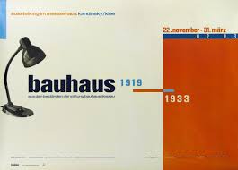
I chose to research the Bauhaus movement. The Bauhaus movement began in 1919, found by a German architect Walter Gropius.

The Bauhaus school

Walter Gropius’ office
It was a school that lasted 14 years – it was forced to close by a Nazi party in 1933. This movement combines fine arts and crafts. The Bauhaus movement teaches “truth to materials” as a core tenet, which means that materials should be used in its most appropriate and “honest” form and nature and should not be changed.
The core objective was a radical concept, to re imagine the material world to reflect the unity of all arts. It combines architecture, sculpture and painting into a single creative expression. Features include;
- whiter walls
- cleaner lines
- use of glass and concrete
- asymmetrical structure featuring walls made of glass
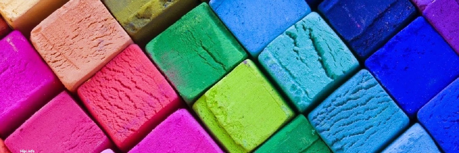
- primary colours
- geometric shapes


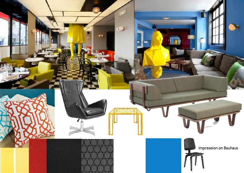
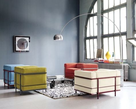
Bauhaus Interiors

VISUAL COMMUNICATION
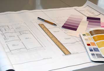
One of the most useful techniques is using 3D rendered perspectives. This gives the client an idea of the true extent of the colour selections particularly with walls and joinery. Always provide real samples to ensure the client signs off on the actual colour specified.
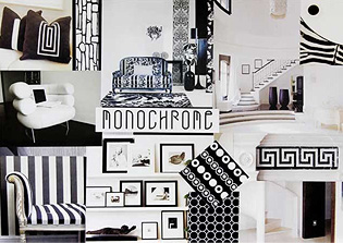
A mood board is used to create a colour palette and try different elements together before putting them in a room. There boards are another form of visual language.

check out this link to get tips on how to make a mood board!
http://www.interiordesignipedia.com/make-a-moodboard.html
Sketch up is also a great programme to make up 3D drawings which gives the client an even better idea of what the final project will consist of.
SUPPLIER RESOURCES
As an Interior Designer it is important we know our supplier resources. We are lucky enough to have a huge amount and variety of different resources at our finger tips. A good way to find these suppliers is to research what is in your local area so you are prepared when you need them. You should also get to know builders, tilers and contractors that could help you out with future projects.

Knowing these material suppliers is great;
![]()
http://www.dulux.com.au/services/colour-consultants.aspx?gclid=CN7d_9fx9MMCFU4IvAodgj0AVA
Websites such as this one are great for keeping up with latest trends
http://www.indesignlive.com/#axzz3SS2bFZ3q
Tip: When selecting colour samples from stores be sure to get a few similar colours so it is possible to correctly colour match. It is also important to check the colour under the appropriate light source, one that is as close as possible to the lighting conditions on site.
THE BRIEF
An Interior Designers job entitles more than what most people think! not only is a designer’s job to decorate and style a certain space, but they also must co-ordinate any other parties that may be involved in the project including architects, engineers, construction managers, contractors and sub-contractors.
Steps in the design process from the “Interior Design Illustrated” book
1. Define problem
2. Formulate program
3. Develop concept
4. Assess alternatives
5. Make design decisions
6. Develop and refine design
7. Implement design
8. Reevaluate completed design
Designers should follow a checklist during client briefing to build a sense of direction to their work. Checklists are great for the designers to analyse the existing site and gather knowledge on what the client wants to achieve. Here is a good site to checkout what question an Interior Designer should be asking their client:
http://www.interiordesignpro.org/blog/interior-designer-may-ask-you
Checkout https://www.thenbs.com/topics/designSpecification/articles/interiorDesignTheDesignBriefStage.asp for a detailed description on the stages of the design brief.
This is great blog for many Interior Design tips!
DESIGNING WITH COLOUR
Interior designers much consider how colour effects our perception of form and the dimensions and qualities of interior space.
Warm hues and high intensities are said to be visually active and stimulating, which cool hues and low intensities are more subdued and relaxing. Light values tent to be cheerful, middle values undemanding and dark colours somber.

When used on an enclosing plane of space, light values, cool hues and greyed colours appear to recede and increase apparent distance. They can therefore be used to enhance the spaciousness of a room and increase its apparent width, length or ceiling height.
Although each of us may have favourite colours and a dislike of others, there is no such thing as a good or bad colour. Some colours are simply in at out of fashion at some times, others may be appropriate or inappropriate for the space being designed. The suitability of the colour depends on how and where it is used and how it fits into the palette of a colour scheme.
A colour scheme is a combination of colours, they can relate and be harmonious or they can contrast against each other. Bright saturated colours and any strong contrasts attract our attention. Greyed hues and middle values are less forceful. Contrasting values in particular, make us aware of shapes and forms.
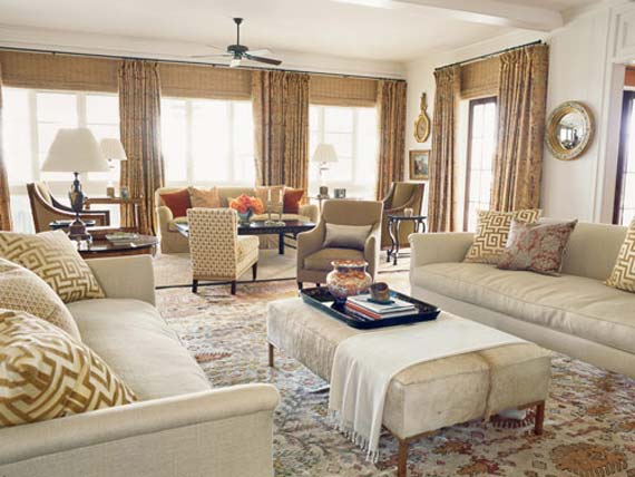
Contrasting room
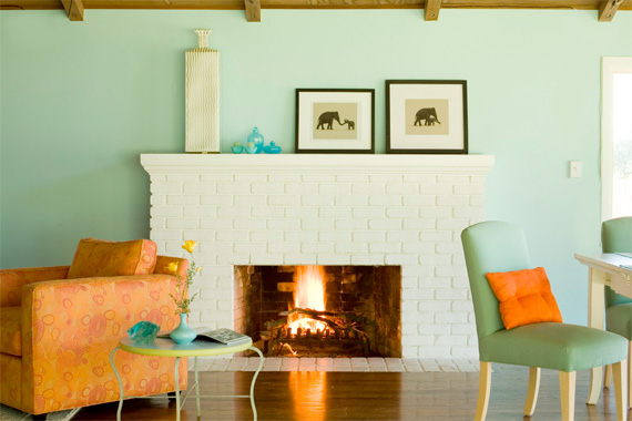
Harmonious room
VISUAL PERCEPTION
People can view colour differently, what I call red, some may see as blue scientists say. An experiment suggests colour perception emerges in our brains in response to our experiences of the outside world, but that this process ensues according to no predetermined pattern.
Vision involves the nearly simultaneous interaction of the two eyes and the brain through a network of neurons, receptors and other specialised cells.
Colour enables us to see the similarities and differences between surfaces according to the full spectrum of light that they reflect.
Here is an optical illusion example
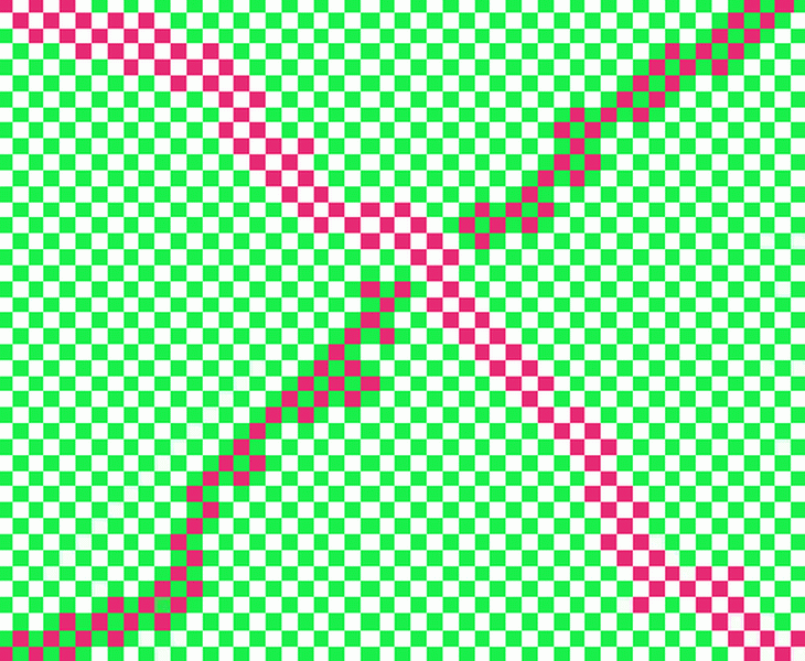
RED VS GREEN
When you first look at this, how many colours do you see? Some might say they see 3 or even 4 colours, but there are 2 – red and green! People usually think they see 2 shades of red, but there is only 1. Look closely and you will notice on one side that white boxes surround the red boxes, and on the other side, green boxes do! Due to the placement of these boxes you get the “illusion” of different colours. Since white is not considered to be a colour (it is the presence of all colours in scientific terms) we can safely say that there are 2 colours present here!
IMPACTS OF COLOUR
Colour plays a vital role in the word in which we live. Colour can sway thinking, change actions and cause reactions. It can irritate or soothe your eyes, raise your bloody pressure or surpress your appetite. When used in the right way, colour can even save on energy consumption. As a designer it’s important to understand the psychological effects colours may have on an average person, or your clients target audience.
Finding the right choice of colours is an art because everyone interprets colours differently. Therefore, the trick is about the entire selection. No colour scheme is ideal or universal. There is no best palette for a specific social or cultural group. We have to understand the meanings of colours so that they can support our message. Colourful information affects the decision making process with a surprising effectiveness. The designers role is to build a clear and understandable communication through the impact of colour. The fewer hues used in a composition the easier the whole thing is to remember.
HISTORY AND CULTURE OF COLOUR
350BC – 1500 A.D.
The great philosopher, Aristotle, in the fourth century BC, considered blue and yellow to be the true primary colours, relating as they do to life’s polarities: sun and moon, male and female, stimulus and sedation, expansion and contraction, out and in, yang and yin. Furthermore, he associated colours with the four elements: fire, water, earth and air. He observed the way light changes throughout the day, and from this study, developed a linear colour system that ranged from the white light of midday through to the black of midnight.

1560 – 1900AD
In 1672, the great scientist, Sir Isaac Newton, published his first, controversial paper on colour, and forty years later, his work ‘Opticks’. When Newton shone white light through a triangular prism, he found that wavelengths of light refracted at different angles, enabling him to see the separate components of the colours of the spectrum, the rainbow. (He was able to shine them back through a prism and achieve white light again, but unable to see any further breakdown if he shone a single colour through a prism.)

By taking the violet end of the spectrum and linking it to the start point (red), Newton created the first colour wheel.

Around the same time (early 1800s), another investigator into the theory of colour, Phillip Otto Runge, developed a three dimensional colour model in the form of a sphere, in order to demonstrate the harmony of colours. His attempt to arrange colours based on their hue and value was a revolutionary approach at that time.

Phillip Otto Runge
It is worth noting at this point that the phrase”primary colours” means different colours in different contexts. When mixing pigments, the primaries used are red blue and yellow, mixing blue and yellow will produce green. However the primary colours when using light in PC monitors or television for example – are red blue and green; yellow is a secondary light colour. Printing primaries are cyan, magenta, yellow and black and psychological primaries are red, blue, yellow and green.
Hermann von Helmholtz was the absolute master of the natural sciences of his day. In 1860 he published the now famousManual of Psychologocal Optics.
Both Helmholtz and Maxwell concentrated on selecting the most suitable diagram to explain the observed facts with regard to colour mixtures. Because the trichromatic theory was both available and accepted, their attention was turned towards the geometry of the triangle, without any consideration of the phenomenological aspects. However, after noticing that the spectral colours must have varying distances to white (which must, in turn, lie at the centre of the triangle), Helmholtz put forward a modified version of Maxwells construction.

Technical models of colour – RGB is used on computers to combine light and CMYK is used to combine pigments.

COLOUR PSYCHOLOGY
I think everyone has a basic understanding of colour psychology and what colours portray when they are seen in advertisements but here is a more detailed analysis of colour psychology.
Whether you’re wondering what colour to paint the office, or you’re looking to redesign your retail space, the colours you choose can increase your chance of reaching your goals. Colour greatly influences human emotion and behaviour. If you’re hoping to make your workers more productive, or you want to encourage shoppers to spend money, understanding the basics of colour psychology can help you design a space that will maximise your potential.
The meaning of colours can vary depending on culture and circumstances.
Each colour has many aspects to it but you can easily learn the language of colour by understanding a few simple concepts which I will teach you here.
Non-verbal Communication
Colour is a form of non verbal communication. It is not a static energy and its meaning can change from one day to the next with any individual – it all depends on what energy they are expressing at that point in time.
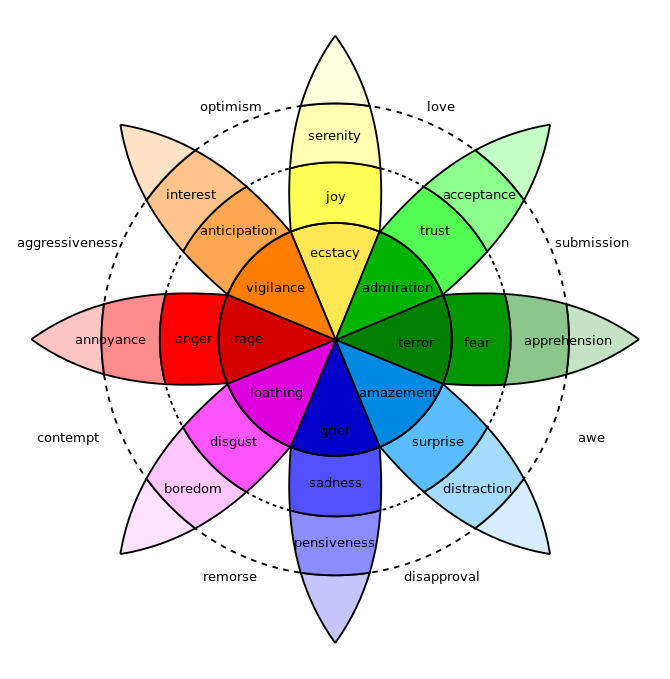
For example, a person may choose to wear red on a particular day and this may indicate that this is their favourite (personality) colour, or they are ready to take action, or they may be passionate about what they are going to be doing that day, or again it may mean that they are feeling angry that day, on either a conscious or subconscious level. All are traits of the colour red. Check out the meanings of colours:

As an Interior designer it is important to know this information as it really effects the way a room or space feels. Warm colours, such as orange, red and yellow can cause people to think the temperature in the room is warmer than it actually is. Cool colours, such as blue, green and light purple cause people to estimate the temperature is colder.

